(Voice clip)
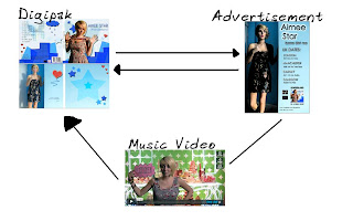
My synergistic link between the products is that the music video links with the digipak, and the digipak clearly links with the advertisement.
When analysing my main product and the ancillary texts, I think that it has a definite link between all three.
Firstly, all photos used were taken on-shoot, therefore already establishing a clear visual link that they are connected.
The Digipak has links to the music video because the images of the artist are all taken on-shoot of the actual music video, where 'Aimee Star' is seen frequently wearing her grey dress (where we used the green screen) therefore the audience can clearly distinguish that it is from the music video. Additionally, I believe that the green screen clips were one of the most memorable, therefore I used those photos.
In the inside covers where she is wearing the black dress, in the music video it is only seen for a brief few seconds (where there are 4 panels of Aimee Star "changing") therefore, all the images are taken on-shoot whilst producing the clips to create the music video.
The same photo used inside the digipak is shown in the advert therefore showing a clear link between the products. However, I edited the photo to make it more conventional and appealing but we can still distinguish that it is of the same photo. Furthermore, the digipak and advertisement has the same font and colour scheme, therefore demonstrating their close link to each other.
In comparison to our main artist, (Marina and the Diamonds) her album 'The Family Jewels', there are visual links, as with all of her music video, there is a general pattern to only focus on her face (like with most artists, who also have a general tendency to only have a close up shot of the artist)
This automatically creates a direct attention as we recognise the face, and it can therefore have clear visual associations.
Here, she had been 'cartoonerized' with a slight floral background, which is simple but effective. My digipak does not follow this convention and mainly focuses on the graphical aspects.
My main inspiration for my digipak was Lily Allen.
My advertisement was very simple and I took ideas and typical conventions that were common in all, and used that to develop my own layout and information.
I think that my combination of the main product and the ancillary texts has been very successful and effective, as it follows the typical conventions and looks visually appealing.


No comments:
Post a Comment