Friday 21 January 2011
Q4
- Charlotte's performance was well done
- Good use of green screen
- Variety of shots good use of close ups as it is of indie pop genre
- Great Editing to the beat
- Strong narrative
- Choreography suited song in video so did props
- locations not typical from our genre, autumnal vibe despite the song being happy
- Misc en scene didn't look right
- colourful. use of animation and speech bubble effective


After the cinema screening a lot of our feedback was positive they all liked the green screen and thought the person in the video performed it well however some of the less postive was that we challenged the covention of indie pop with two of our shots the shadow shot and the studio shot they said that it was too dark and did not link to our bright and colourful other shots however when doing it we thought it was to show her different side and her self as she is but i guess after the feedback i still would want to show it but in a different way. So yes i agree that you dont find these kind of shots in indie pop genre so maybe we should of added coulours in the background to make it fit in.
Q2
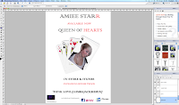
All 3 products have a visual link the heart is a main visual link that i have incorporated cards are really important in my 3 products as i show it in the advertisement and my digipak to show the visual link.


Tuesday 18 January 2011
Q3
wwhewQ3 How did you use media technologies in the construction and research planning and evaluation stages?


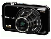 we made a story board for our planning we used FujiFilm Finepix jx digtal camera.
 I used photo shop to edit my picture and change the background of my image i also used to make the the graphic images of my club suits by using the shape tool on photo-shop and to manipulate my picture as one of the images on a fan of playing cards.
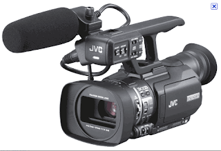 we used jvc camera to record our actual music video it was pretty much the same as last year however this year i found it hard as we had to hand held our camera which was harder to keep a steady hand but part from that it was simple
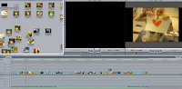
 we used final cut the first time when making our story board this helped give us see how our our music video will look

when constructing my 3 products my digipak and advertisement i used blogger to research past students work to get a feel of what needs to be done also to plan what i will be doing in my products and blogger helped me share it with my group and teachers.

I used You-tube in a original way i used it to get a view and to see what kind of camera angles and props the genre i was doing used i also used you-tube to find the song we used in the end which was Marine and the Diamonds OH NO

i used it to help me get ideas for my digipak and my advertisement i used the basic Google images ei also used to research my genre and to get ideas of mise en scene and costumes to have
 we made a story board for our planning we used FujiFilm Finepix jx digtal camera.
 I used photo shop to edit my picture and change the background of my image i also used to make the the graphic images of my club suits by using the shape tool on photo-shop and to manipulate my picture as one of the images on a fan of playing cards.
 we used jvc camera to record our actual music video it was pretty much the same as last year however this year i found it hard as we had to hand held our camera which was harder to keep a steady hand but part from that it was simple
 we used final cut the first time when making our story board this helped give us see how our our music video will look
 we also used chrome key this helped us to change background and make it look like our artist is in a different place.
What have you learned from your audience feedback?
Positive Feedback
Negative Feedback
"Some locations could have been more appropriate"
- I agree with this comment as during production of our music video and the filming process, we had filmed in the 'play room' scene with the pool table and I believed the shots really suited the genre and it looked really good (as you can see with some of our previous production photos) but in the end we did not use it because we analysed the shots and realised that there were some faults with the mise-en-scene e.g. keys on door, other props seen on screen. Additionally, as it was one of our first ever shots we took, our camera skills were not as improved compared to later on when we filmed in the other places.
To improve on this, we can definitely improve our camera skills and widen our locations- possibly by following a narrative so that the singer is in different locations rather than randomly switching back and forth as the song progresses. Additionally, we can add more suitable locations such as using more green screen, colourful places etc, as such from where our first ideas came from.
"The texts were not that effective"
- I agree with this feedback because I think that the text font, and text transitions could have been better done. Although it suits the genre, it has a hint of unprofessionalism, because I think it wouldn't be shown on music channel on the television. Perhaps the font was too typical, and the transitions was too obvious and amateur-like.
To improve on this, we can change the how the text comes into the video, and as with our music video, it only appears at a certain point, we can consider to use more text within the video to have a sense of continuity.
On the whole, the majority of the audience really liked our music video. It was upbeat, funky and followed the general conventions of a music video. I have learned that to make a effective, seamless video, it is important to take many different shots (and also in different positions for match-cut purposes.) Having many base tracks is very useful as it is continuous, and if any faults go wrong, using the base tracks are beneficial and can be used as a alternative. Mise en scene is especially important, in terms of acting and the locations as it can determine what makes a 'good' video. Editing all the sequences and adding on transitions/effects/texts is difficult, but if done correctly, can really make a video look really effective.
Link to: Vimeo Audience Ratings
Summing up, the planning, research and production has developed and improved my skills and abilities of using technological aspects such as the video camera and Photoshop for example. I learnt how to work under pressure, meet deadlines and co-operate and bond with my other team mates. Overall, the whole experience and products made had paid off! :)
How did you use media technologies in the construction and research, planning and evaluation stages?
The technology used to create the video, digipak and advertisement was vital, and it cannot be done without using these fundamental programmes. It can make a piece of work look to a professional standard.
Additional key elements were used in creating the products. This included:
- Using 'slugging' in Final Cut Pro was very useful, as it can make two separate video clips combine or merge into one. This was a main aspect of our video clips at some parts, to help with our transitions to the next scene/clip.
- Additionally, the 'magic tool' in Photoshop was very useful as it cut out all of the existing background, without having the pixelated remains of the edges of the artist, for example if I were to manually rub out all of the background.
This was created in Final Cut Pro, by importing the pictures into the timeline, and having the audio soundtrack playing in the background.
This was created using Gimp, by creating the storyboard I had drawn into a moving image (gif)
How effective is the combination of your main product and ancillary texts?
(Voice clip)

My synergistic link between the products is that the music video links with the digipak, and the digipak clearly links with the advertisement.
When analysing my main product and the ancillary texts, I think that it has a definite link between all three.
Firstly, all photos used were taken on-shoot, therefore already establishing a clear visual link that they are connected.
The Digipak has links to the music video because the images of the artist are all taken on-shoot of the actual music video, where 'Aimee Star' is seen frequently wearing her grey dress (where we used the green screen) therefore the audience can clearly distinguish that it is from the music video. Additionally, I believe that the green screen clips were one of the most memorable, therefore I used those photos.
In the inside covers where she is wearing the black dress, in the music video it is only seen for a brief few seconds (where there are 4 panels of Aimee Star "changing") therefore, all the images are taken on-shoot whilst producing the clips to create the music video.
The same photo used inside the digipak is shown in the advert therefore showing a clear link between the products. However, I edited the photo to make it more conventional and appealing but we can still distinguish that it is of the same photo. Furthermore, the digipak and advertisement has the same font and colour scheme, therefore demonstrating their close link to each other.

In comparison to our main artist, (Marina and the Diamonds) her album 'The Family Jewels', there are visual links, as with all of her music video, there is a general pattern to only focus on her face (like with most artists, who also have a general tendency to only have a close up shot of the artist)
This automatically creates a direct attention as we recognise the face, and it can therefore have clear visual associations.
Here, she had been 'cartoonerized' with a slight floral background, which is simple but effective. My digipak does not follow this convention and mainly focuses on the graphical aspects.


My main inspiration for my digipak was Lily Allen.
My advertisement was very simple and I took ideas and typical conventions that were common in all, and used that to develop my own layout and information.
I think that my combination of the main product and the ancillary texts has been very successful and effective, as it follows the typical conventions and looks visually appealing.
In what ways does your media product use, develop or challenge forms and conventions of real media products?


The conventions that most or all artists do when singing is to directly look into the camera, to engage with the audience. Mid shots and close ups are shown frequently which is a fundamental characteristic. Additionally, use of microphones (also in live gigs) is a common convention which in our music video has demonstrated.
Kate Nash's music video, Pumpkin Soup demonstrates her use of animated texts within the music video. Her dress style and performance is also common with our own music video. However, we challenge this by using green screen, (due to the reason we cannot make a actual real setting) and we have a upbeat song so we would have more obvious visual editing.


These are some of the comparisons between existing 'indie pop' artists that we were inspired by, and I made the links of our own video to theirs by showing how we followed these typical conventions of music videos. The camera shots, costume, locations and green screen and all evidently shown in our music video, and also in these other 'indie pop' artists too.
Our group was mainly influenced by Lily Allen, as she fits in with the 'indie pop' genre. Her music video, 'LDN' uses narrative structure which is linear, illustrating her song about 'London's dull reality.' The editing used has many match cuts, for example when she spins around it is in-sync in different angle shots and camera position. There is editing used continuously, where there is vivid colour and a change of setting, emphasising a 'fantasy' world but what's left behind her dull and gloomy by showing the sharp contrast between the two. We challenged this convention of using a non-linear mix instead, as there is no clear narrative as we progress through the song, but only towards the end and only focusing on the artists acting and performance.

I developed the conventions of my digipak, by looking at the common features shown on most CD/digipak albums. I included a iconic and appealing photo of the artist, readable fonts, and the fundamental aspects such as barcode, album name/artist name and copyright issues.

Here I followed the conventions of a typical tour gig, where it includes all the dates, venues and links to the artist/band, e.g. Myspace. There is a large image of the band group so it clearly indicates who they are and large, clear fonts which are easy to read. I also added an additional mini advert to promote
the advert. I followed these conventions because I made a clear colour scheme and did not include
any unnecessary graphics that can overload the whole image. It can be argued that I challenge the layout and theme compared to the digipak, as the digipak has a very graphical approach, whereas my advert is simple, but still effective.
Sunday 16 January 2011
Feedback from draft evaluation
Hello group 32
Jo has posted feedback for each evaluation draft blog entry. To get to your feedback please click on '1 comment' link at the bottom of each blog entry.
Don't forget the final deadline is Friday!!
Jo has posted feedback for each evaluation draft blog entry. To get to your feedback please click on '1 comment' link at the bottom of each blog entry.
Don't forget the final deadline is Friday!!
Friday 14 January 2011
Evaluation
Q1 In what ways does your media product use, develop or challenge forms and conventions of real media products?
I think that my music video breaks the convention of indie pop genre it uses similar camera angles,editing and mise en scene but i feel that our costume is a strong fit to indie pop genre.
This shows a clear link that our music video has the same camera angles editing and shoe similarities of closeups lighting the costume is very similar to the one we had for our artist Amiee Starr there is a quite a few reputation which we also have this comes across her digipak cover.
Some screen shots of both lilly allen and our muscic video of a clear similarities in the camera angle.


Above showing a clear similarities in costume which represent the indie pep genre
When the planning of our music video the type of artist that influenced us was artist like Kate Nash, Lilly Allen and Florence and the machine when looking at the style of our artist Amiee Starr we where mainly influenced by Lilly Allen and we also used some of the way Florence performance in her video also alot of the artist we used used their hands in alot of the dance movement this is also some thing we used.
Shown below some pictures of artist that influenced us.


When the planning of our music video the type of artist that influenced us was artist like Kate Nash, Lilly Allen and Florence and the machine when looking at the style of our artist Amiee Starr we where mainly influenced by Lilly Allen and we also used some of the way Florence performed in her video also alot of the artist we used used their hands in alot of the dance movement this is aslo some thing we used.
Our costume design for Amiee Starr also had some influence from the original artist video Marine and the diamonds.


When looking at the Florence video you can see the camera angle and the way we held the camera was very simmilar but with our artist we had many images imported into green scree where as Florence just had the one but this like us this image is carried in other parts in the video.


 The animated words we used near to the end of our music video comes up n the indie pop genre also crops up in one of the female artist that influenced us Kate Nash
However our video breaks the convention of the indie pop genre such as the location of Amiee Starr in the studio singing into a microphone without make up we did this too show her fans the real her even-though this type of style does not come under the genre of indie pop but R n B.
Subscribe to:
Posts (Atom)