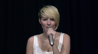
The conventions that most or all artists do when singing is to directly look into the camera, to engage with the audience. Mid shots and close ups are shown frequently which is a fundamental characteristic. Additionally, use of microphones (also in live gigs) is a common convention which in our music video has demonstrated.
Kate Nash's music video, Pumpkin Soup demonstrates her use of animated texts within the music video. Her dress style and performance is also common with our own music video. However, we challenge this by using green screen, (due to the reason we cannot make a actual real setting) and we have a upbeat song so we would have more obvious visual editing.
These are some of the comparisons between existing 'indie pop' artists that we were inspired by, and I made the links of our own video to theirs by showing how we followed these typical conventions of music videos. The camera shots, costume, locations and green screen and all evidently shown in our music video, and also in these other 'indie pop' artists too.
Our group was mainly influenced by Lily Allen, as she fits in with the 'indie pop' genre. Her music video, 'LDN' uses narrative structure which is linear, illustrating her song about 'London's dull reality.' The editing used has many match cuts, for example when she spins around it is in-sync in different angle shots and camera position. There is editing used continuously, where there is vivid colour and a change of setting, emphasising a 'fantasy' world but what's left behind her dull and gloomy by showing the sharp contrast between the two. We challenged this convention of using a non-linear mix instead, as there is no clear narrative as we progress through the song, but only towards the end and only focusing on the artists acting and performance.
I developed the conventions of my digipak, by looking at the common features shown on most CD/digipak albums. I included a iconic and appealing photo of the artist, readable fonts, and the fundamental aspects such as barcode, album name/artist name and copyright issues.
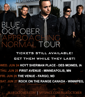
Here I followed the conventions of a typical tour gig, where it includes all the dates, venues and links to the artist/band, e.g. Myspace. There is a large image of the band group so it clearly indicates who they are and large, clear fonts which are easy to read. I also added an additional mini advert to promote
the advert. I followed these conventions because I made a clear colour scheme and did not include
any unnecessary graphics that can overload the whole image. It can be argued that I challenge the layout and theme compared to the digipak, as the digipak has a very graphical approach, whereas my advert is simple, but still effective.


No comments:
Post a Comment