Showing posts with label Yasmeen Ismail. Show all posts
Showing posts with label Yasmeen Ismail. Show all posts
Friday, 21 January 2011

Friday, 14 January 2011
Evaluation - What have you learnt from your audience feedback?
This is our Final music video which received great feedback after it was shown at the cinema as seen below:
The video was then shown again to our class some these were some of the comments:
- Charlotte's performance was great
- Good use of green screen
- Variety of shots good use of close ups as it is of indie pop genre
- Chereography suited song in video so did props
- locations not typical from our genre, autumnal vibe despite the song being happy
- Misc en scene didn't look right
- Great editing to the beat
- Colourful. use of animation and speech bubble effective
- Strong narrative
Evaluation - How did you use media technologies in the construction and research, planning and evaluation stages?
We used many media technologies etc in the construction and research and evaluation stages.
Firstly we used the internet and websites such as You Tube to search for potential songs and to look for videos to inspire us as well as looking at the original video to make sure it wasn't very similar to our video. I searched for the artist in you tube and many of their songs came up for me to look at similar videos. After the video was over i used you tube's suggestions to see more videos from the indie pop genre which aided my research.

 We also used blogger in the form of a log to keep track of what we have been doing through planning, production and evaluation.
Blogger was extremely important as it allowed us to track our work in terms of planning we also embedded videos by clicking on html.
We also used blogger to obviously upload our work for the evaluation and other tasks. We also used it to demonstrate our music video and to display our final products. In addition we used blogger to see previous students work to see what our blogs should look like.
We used state of the art video cameras which we used to film our music videos. We also used memory cards to transfer files from the camera to Final Cut.


---------->


---------->
Editing:
For editing we used Final cut to edit our music videos. Final cut was easy to use, we had to import our footage as seen below. Final cut was the most important package we used as it allowed us to create our animatic at the beginning of planning and allowed us to create our video, final cut also allowed us to manipulate footage by slowing and repeating footage and effects such as cross fade to make transitions more smooth.


Then put our footage/ base tracks on top of each other in a timeline and cut using the cutting tool. As our genre was indie pop there was a huge amount of editing to be done. Editing also involved using the colour picker and the chroma-key pictured below to get the green screen to match the background, this sometimes proved to be difficult but we were successful in the end. To correct the images using chromo key we had to play around with the tabs until the footage was perfect.


This is our timeline towards the end of the project:

I used Photoshop to create my digipak and advertisement, i used photoshop to add many symbols and animation as pictured at the side, this gave my digipak a cartoon feel which suited the genre and the style of the music video.


I also used Photoshop to manipulate images for example the image of Aimee Star in the front cover of the digipak using effects. I also used the magic tool button to remove Charlotte from the background and the themes pictured below to manipulate the image.

For mine i used the dark strokes effect which made the image seem more effective and more compatible for my genre.
Firstly we used the internet and websites such as You Tube to search for potential songs and to look for videos to inspire us as well as looking at the original video to make sure it wasn't very similar to our video. I searched for the artist in you tube and many of their songs came up for me to look at similar videos. After the video was over i used you tube's suggestions to see more videos from the indie pop genre which aided my research.

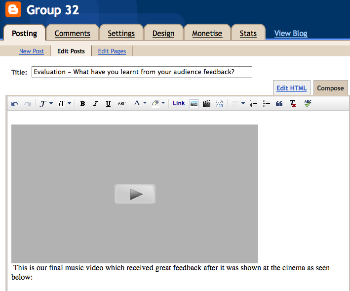 We also used blogger in the form of a log to keep track of what we have been doing through planning, production and evaluation.
Blogger was extremely important as it allowed us to track our work in terms of planning we also embedded videos by clicking on html.
We also used blogger to obviously upload our work for the evaluation and other tasks. We also used it to demonstrate our music video and to display our final products. In addition we used blogger to see previous students work to see what our blogs should look like.
We used state of the art video cameras which we used to film our music videos. We also used memory cards to transfer files from the camera to Final Cut.


---------->


---------->
Editing:
For editing we used Final cut to edit our music videos. Final cut was easy to use, we had to import our footage as seen below. Final cut was the most important package we used as it allowed us to create our animatic at the beginning of planning and allowed us to create our video, final cut also allowed us to manipulate footage by slowing and repeating footage and effects such as cross fade to make transitions more smooth.


Then put our footage/ base tracks on top of each other in a timeline and cut using the cutting tool. As our genre was indie pop there was a huge amount of editing to be done. Editing also involved using the colour picker and the chroma-key pictured below to get the green screen to match the background, this sometimes proved to be difficult but we were successful in the end. To correct the images using chromo key we had to play around with the tabs until the footage was perfect.

(We had to play around with the tabs on the left hand side until the green screen disappeared.)

(These images also show us in the process of editing...)

This is our timeline towards the end of the project:
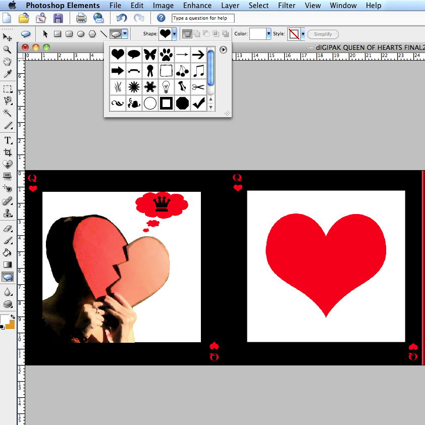
I used Photoshop to create my digipak and advertisement, i used photoshop to add many symbols and animation as pictured at the side, this gave my digipak a cartoon feel which suited the genre and the style of the music video.


I also used Photoshop to manipulate images for example the image of Aimee Star in the front cover of the digipak using effects. I also used the magic tool button to remove Charlotte from the background and the themes pictured below to manipulate the image.

For mine i used the dark strokes effect which made the image seem more effective and more compatible for my genre.
Evaluation - How effective is the combination of your main product and ancillary texts?
I believe the concept of my album works well through the combination of the main product (music video) and the ancillary texts (digipak and advert.)
The design is of course inspired by the Queen of Hearts playing card pictured below:


The inside left panel of my digipak is also directly linked to the video Oh No! With the use of the thought bubble... This directly links the digipak with the music video.
The design is of course inspired by the Queen of Hearts playing card pictured below:


Also, in the video a love heart is used as a prop which ties the three products together. This therefore goes with the idea of Aimee Star being 'The Queen of Hearts.' Aimee Star's character is animated and cartoon like, which carries on into the digipak and advert for the 'Queen of Hearts.' The colour scheme of black, white and red is also present in all three products


The inside left panel of my digipak is also directly linked to the video Oh No! With the use of the thought bubble... This directly links the digipak with the music video.
Evaluation - In what ways does your media product use, develop, or challenge forms and conventions of real media products?
I believe my music video, digipak and advert both use and break the conventions of the indie pop genre. It uses the conventions through the use of camera angles, editing and misc en scene particularly lighting and costume. The indie pop genre generally uses a wide range of camera angles, but usually focuses on the singer/singers with many close ups. The editing is usually fast and smooth and the lighting also tends to be bright. Also costume tends to be colourful and edgy. A music video I was inspired by was Lily Allen - LDN.
As you can see the camera angles are conventional of the indie pop genre as there are many camera angles and a lot of close ups, as the main focus is the singer which is similar to our music video. The lighting is bright as seen in our music video. In terms of editing there is also a lot of repetition which emphasises the pop side of the genre. Furthermore the costume is very similar to Aimee Star's in the video and is also evident in the album cover of Alright Still the debut album from Lily Allen.


This style of wearing dresses with converse is also portrayed in the original video to Oh No! by Marina and the diamonds:


This costume would directly appeal to our target audience as it is edgy and different, celebrities such as
Kristen Stewart and Scarlett Johansson who are seen as style icons have worn this in the past, so our target audience would be familiar with this look. The fact that the look is edgy and different follows conventions of the indie pop genre. The costume changes between verses is also conventional to our genre which is seen in the original video of Marina and the Diamonds - Oh No!
Our video also broke the conventions of the indie pop genre with some of the locations for example the scene where Aimee Star is singing into the microphone, using a microphone in an indie pop genre is rare and is more conventional to the pop or r'n'b genre.
The animated words in our video is a convention of the indie pop genre seen below, in the videos of Mystery Jets ft Laura Marling - Young Love and Kate Nash - Doo Wah Doo and in our video.


We have also followed the conventions by using the green screen which can also been seen in the video of
Two Doors Down - Mystery Jets:


Here are some images from our video which show green screen in use:


Friday, 7 January 2011


Monday, 13 December 2010


AIMEE STAR queen of hearts. <--- Engravers font.
As the album is called Queen of Hearts I have decided to incorporate the theme of playing cards into my digipak. Therefore my colour scheme will be white, black and red.
The font I have chosen is Engravers as it is bold and is a similar font used for a deck of cards. The front of the album will resemble a card with an image of the artist being mirrored to resemble the Queen on a pack of cards.

The name of the artist will be bigger than the name of the album in order to follow the conventions of a digipak. To ensure there is a consistent theme each panel will be have the border again to resemble a playing card.
Potential pictures for Digipak.
These photos could be used for my digipak as they are bold and suit the genre. The first picture is edgy and striking which would be good for a front cover, the second photo could also be used for the front cover because it is a commercial photo. The last photo links in with our music video so it would be effective if i used it in the inside.


Friday, 3 December 2010
Analysis of 3 digipaks that relate to your genre.

This is the digipak for Mika, who is of the pop genre although our genre is actually indie pop, my digipak should also be eye catching but not as bright as this as my genre is also indie. The audience is similar to my artist as mainly females listen to Mika's music, this will be the same for my artist Aimee Star.

This is the digipak for Katy Perry's new album Teenage Dream. The use of black is links in with the indie rock genre, which i will incoporate in my digipak. There is also an ongoing theme through each panel which i will also have. This links in with my audience as Katy Perry's audience will be similar to my artist's because of the pop, rock influence and because Katy Perry's audience is mainly teenage girls which is hinted in the title 'Teenage Dream.'
This is a song from her album which demonstrates that it links to my genre and audience.
This is the digipak of Florence and the Machine's debut album Lungs. Florence is also of the indie pop genre this is evident with the use of black which takes up most of the digipak. The pair of lungs on the back which are labelled also show the kookiness associated with indie pop, the romanticism shown in the front cover with the flowers and feminine pose also suggests that the audience is mainly female, which is similar to my artist.

Here is a song from the album.
Subscribe to:
Posts (Atom)